Showing posts with label ATC. Show all posts

Sunday, July 06, 2008

ATC Box

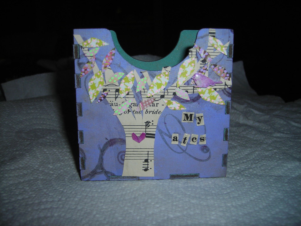
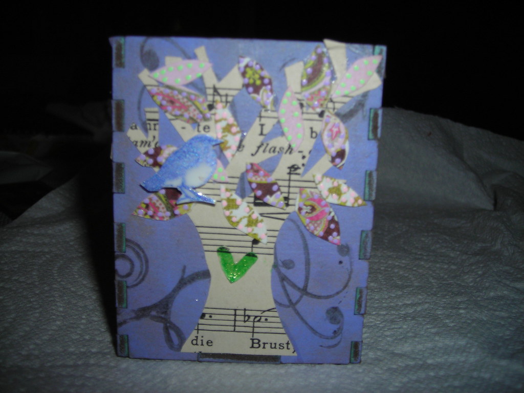
I just finished up this ATC box as part of my work for Retro Cafe Art Gallery. It comes in pieces that you assemble--which makes the decorating process a lot easier. I used chalk inks in purple and brown and then heat set them for the background. I over stamped with some Stazon for the swirls. The trees and leaves are all hand cut out. And the bird is shrink plastic. Each side has a tree and a bird, but I've only posted 2 sides. (sorry my pictures are so bad. I am so NOT a photographer!)

I've been hard at work on some other projects, so I'll try to be good about posting this week. I hope everyone had a happy 4th.

Wednesday, May 07, 2008

ATC Shrine

Here are some photos of this great ATC shrine that I made as part of my design team work for Retro Cafe Art Gallery. The shrine is made out of wood that comes in a big sheet that you punch out and glue together. It can be painted or inked. I used distress crackle paints on mine.
Here is a side view--I actually made the ATC using mounting foam so that the boy looked like he was in a shadow box. But I don't think it shows very well in the pictures. You can, however, see the mounting tape in this picture.

And so that you can see the scale, here is a photo of it hanging on the wall in my studio.

Friday, April 18, 2008

Men ATCs

I know, I've been gone a long time.
Sigh.
I've been having some health issues and in between being poked and prodded by various doctors and battling my insurance company (who seem to feel that being human is a pre-existing condition)I just haven't had much energy to do much posting.
But I did manage to get my ATCs done for the swap on Saturday. The theme this month is Men; mostly because we did women last month.
Here are my cards:

I used this really wonderful technique and the Ranger ink blender tool to make the backgrounds. (For which I will post a tutorial some time this week, scouts honor.) The orange and blue background stamps are both by Paperbag Studios, the green is by Inkadinkado, and the purple is by Rhonna Ferrar. I used some alcohol inks on the buttons to get that lovely aged look.
All in all, I'm happy with the way they turned out.

Friday, March 14, 2008

Returning to your roots

This week has been very stressful for me. We've had car issues (mechanics, need I say more?) and health insurance issues (trying in to reduce their costs by killing me with paperwork) and I haven't been sleeping...I hit this place yesterday where I thought I could feel my brain trying to explode out of my head. And then to top it off the IAA is meeting on Saturday and we have a record 12 people coming! that's 11 ATCs that I had to get done. Normally, art is a solace for me, but when I sat down at my studio table all I wanted to do was cry at the thought of having to make so many cards.
But then, something wonderful happened; I pulled out my trusty copic markers (have you seen them? They're amazing! Alcohol based, so no nasty cancer causing chemicals, completely refillable with replaceable nibs, so environmentally friendly and beautiful transparent colors) and I started to color. All of a sudden, I remembered when I was little, how much I loved to color. First with crayons and then later, with colored pencils. It was a form of meditation for me, putting color to the world and settling everything inside. And as I sat at my table coloring in my ATCs for this Saturday, I found that same safe place inside of me. Everything relaxed, everything stilled and the world, for once, did not seem such a chaotic place. Instead it was awash in transparent colors reflecting a serenity I'd all but forgotten.
You should try returning to your roots--find that first thing about art that you loved and do it again. See if it doesn't still fill you with wonder.
Here are a sampling of my cards--I couldn't fit them all in one scan since there were so many of them. The name of the stamp I used here is "Anxious Annie," I thought it was fitting. You really have to click on the picture to get a real idea of what the colors look like. Since the cards are so small here, you can't see the detail.


Hope everyone has a wonderful weekend.

Tuesday, January 22, 2008

Birds!

We had our monthly meeting of the artistic minds and swap this last Saturday; the theme this month was birds. Here are my cards:


I used alcohol inks for the backgrounds, with playing cards as the base (which is why they're a bit shinny.) The eggs are from old text that I used a bit of distress inks on. The birds are by Retro Cafe Art Gallery--who by the way has a lovely new site up. You should go on over and take a look. If you're feeling really wiley you could click on the design team link and see a fun picture of me when I was a wee-one.

Wednesday, November 28, 2007

Fa La La La La

I have been hard at work on my ATCs for the Indiana Altered Art swap/party this weekend. Here they are:

All images here are from Retro Cafe Art Gallery.

Tuesday, September 18, 2007

Drawing

I'm sorry it's taken me so long to post this. I have no excuse, other than sheer laziness. So without further ado:

In celebration of breaking 10,000 visitors to my blog I am having a drawing for four collage sheets by my friend Kris Hubick, a bottle cap pendant and an assortment of small papers from Dolphin Papers. Just sign in and leave a comment and I will draw the name a week from today.
Here's a picture of everything all together.

Saturday, September 15, 2007

ATC Time

The Indiana Altered Art gals met up this morning for some coffee and some ATC fun. This month's theme was Halloween. I had a lot of fun making these cards since Halloween is one of my favorite holidays. here are my cards.

And here we all are--there have gotten to be so many of us! It's such fun, although nobody can here what anyone else is saying since we all talk at once!!!

Sunday, August 19, 2007

atc swap

The Indiana altered art group met yesterday for our ATC swap. Here are my completed cards that I made using the technique I talked about here. Our theme for this month was Hot so I used pin-up girls for mine.


And here we all are. Well, everyone but me, Bev & Diana (whom were greatly missed this month)...we've gotten pretty big! We started out with just four and are up to eight! If you live in the Indy area you really out to come and play with us sometime!

Thursday, August 16, 2007

Pearl-Ex Tutorial

I have had a bunch of people asking me about using pearl-ex powders over the last couple of weeks. Heaven only knows why--I guess I must have some sort of "Ask me about Pearl-Ex Powders" sign on my back. In any event, I thought I'd just post a quick tutorial about using them. For this project I did an ATC and used them with my alcohol inks because I think the textures work together beautifully. So, here is a picture of everything I used to create this ATC minus the stamp and the playing card. I used: Pearl-ex powder in blue, red, yellow, and currant alcohol inks, dauber, soft-haired paint-brush and a watermark stamp pad.

The first step is to load the dauber with ink placing the three colors so that they are touching. This creates a nice agate look to the inks when they mix. Here is a picture of my dauber loaded and ready to go.

Then just dab, using an up and down or "pouncing" motion. If you drag it, the inks will smear and then not blend well.

You can re-layer more ink on top of what you've got if you're not happy with the way it looks. Once you're happy with the way it looks, let it dry completely. If there is even a little of the ink left on the card it'll interfere with the watermark ink. I normally let it set about 15 minutes or so.
Once it's dry, load-up your stamp with watermark ink and stamp away. If you're going to do more than one image it's a good idea to work in batches--ink one, apply pearls and then move one. The watermark ink won't stay wet long enough otherwise.

Take your soft bristled brush and pick-up a small amount of the pearls with it. A little bit of this stuff goes a really long way. (And you want to be sure your surface is covered with scrap paper and you're wearing your old art clothes because this stuff does have a tendency to get on everything. I learned this one the hard way when I had one ill-timed sneeze.) Take it and gently brush across where you stamped. This is why you need a soft brush, the stiffer bristles will wipe away the ink and leave drag marks through your image. You can see the swirls starting to come through here.
I then went on and repeated the process for the top of the playing card. Here is a picture of what it looks like when it's all dry.
Then all that's left is to decorate! I used mine for the upcoming ATC swap through the IndianaAlteredArt group, the theme of which is "Hot."

Hope this was helpful and as always, if you have any questions please feel free to email me.
Wednesday, June 13, 2007

Baby Wipe ATCs


I am in a swap right now using baby wipes and watercolors as the backgrounds. Here are two of them. In both cases I folded and dipped the wipe into the watercolors. Both of the stamps here are from Oxford Impressions. In fact, the third one that I did (which I hope to post tomorrow as it is still drying) I also used an oxford impression stamp. I think I've been in a mood for them lately. Anyway, I stamped them using Satzon onto a transpanrency and then attached. I wanted the background to show through.
I have a couple of HUGE projects I'm working on as part of my design team responsibilities and I hope to start posting some of it tomorrow.

Thursday, May 17, 2007

More Choclate ATCs

Here are a few more of my ATCs for the chocolate swap. I've really enjoyed making the cards for this swap--mostly because it's given me an excuse to eat lots of good chocolate for the wrappers.


This last little picture is a gift tag I made for my friend Kasia using my new notch cutter.

Tuesday, May 15, 2007

Chocolate

So I've had a busy couple of days--we had a dinner party this weekend and it was a lot of work. But now that things have calmed down I'm trying to get caught up on my art.
Our monthly ATC meeting is coming up and I've been working on my cards. Our theme this month is chocolate. So naturally, I've been sampling as much chocolate as I can in preparation!
Here are two of my cards:


I also did one of my journal prompts from the very brilliant Randi which was repetition of images. I'm not much for taking photographs (gasp!) but I used images from a magazine. I like eyes so that's what I used. This spread was made using acrylics and stamps as well as markers. I am just in love with the PITT markers, they will draw on anything!


Monday, April 23, 2007

Wednesday Stamper


The theme for this weeks Wednesday Stamper is grunge, I haven't really tried this technique before, so I thought I'd try it out on an ATC. I started with a base of Lumiere paint, and then layered a bunch of different stamp inks on top of it, using a brayer. The bird stamp is by Rhonna Ferrar and the stitching and lettering are rub-ons.

Sunday, April 22, 2007

Lovely Day

Spring has finally decided to put in an appearance. Yesterday it was in the low 70's, with a lovely balmy breeze. Bye-bye snow! We had our ATC meeting yesterday morning and exchanged our Nude atcs. I got some really beautiful cards--take a look! I can't decide which one is my favorite. Every time I make-up my mind I change it.

Here we all are-- we actually it's everybody but me, since I was taking the picture.


After the meeting my hubby and I headed to TASTE for lunch. If you live in Indianapolis and have never been to TASTE shame shame on you! The best breakfast/lunch in the city. Their fries are to die for. Take a look:
That's some sort of truffle-oil dipping sauce that they're served with. (Which I like to pretend is magical and has no calories.) Not only is the food fabulous, but they always have cool art up on the walls for sale. While we were eating yesterday there was a little four-year-old boy at the table next to us, who insisted on putting his fries in his water glass and then rubbing them on his shirt before eating them. My husband said that you have to respect the kid for actually eating the mushy food.
So, good weather, art, and then yummy food. I can't think of a more perfect Saturday.

Friday, April 20, 2007

More ATCs


So here are the last of my ATCs for our meet-up tomorrow. I am going to try and remember to take my camera so that I can get some pictures of everyone and their lovely cards. Again, all the backs are alcohol inks. The last card has a Tim Holtz stamp embossed on it. All the fibers are Basic Grey.

Thursday, April 19, 2007

Some ACTs

So I belong to a local ATC swap group and we are meeting this Saturday to do our monthly trade. The theme this month is nudes...so here are a few of my completed cards. I have three more to go. If you live in the Indianapolis area and are interested in joining us please feel free to click my contact me button to the right!


All of the backgrounds are playing cards that have been altered using alcohol inks. All the fibers are by Basic Grey.
So I know I don't normally post twice in one day, but tomorrow I'm out of town for most of the day doing stuff for my design team job. So have a happy Friday everyone.

Saturday, April 14, 2007

Wednesday Stamper


The theme for this weeks Wednesday Stamper is cars, so I created this little ATC, using a dyed baby wipe that I sewed onto the ATc Back. The sun stamp is just one I picked up for a dollar at Jo-Anns, and the man in the car is a Tim Holtz stamp.

Wednesday, March 21, 2007

A picture and a couple of ATCs


So I was going through some old photographs today and I came across this one of my brother Andrew. There's no date on this, so I don't really remember what this was for. (Andy, do you remember?) But I got a big kick out of it because he's so serious in this picture and if you knew him you'd know that he's NEVER serious. I am so lucky to have someone who is more than family; he's one of my best friends.

I made a couple more ATCs this week for the meeting this weekend. This first one is a Tim Holtz stamp, that I cut out. The background is embossed with some Pear-ex and clear embossing powder. I cut out the crown, and the text. The purple part of the background is hand dyed paper towels.


This ATC is a stamp by Lost Coast Designs. I rolled on some different colored inks to get the metallic effect. I cut it out and placed the image behind it. Pretty simple, but I like it.

Monday, March 19, 2007

Some ACTS

There is a local group here in Indianapolis that just started up--we meet once a month to swap ATCs and talk art. I've been trying to make up some cards to have to take the the meeting this weekend. If you live in the Indianapolis area and would like to come send me an email (click the contact me button to the right) and I'll give you the specifics.

This first one I did mainly by stamping two different stamps direct onto paper. First the diamonds, and then when it was dry, the text. The wings are also a stamp that I embossed using clear embossing powder and some pearl-ex powders.

The scan for this atc really doesn't do the background Justice. I used the same diamond stamp, but inked a Latin text and stamped it direct to the diamond stamp. Which is why the text only shows on the diamonds. The text is a rub-on by making memories. Oh, and the Russian text, is actually Shakespeare.

This last card is my favorite. And once again, I don't think that my scanner really did the background justice. I embossed little tiny stars with pear-ex powder and clear embossing powder. I stamped the birds and using some brown and blue stamp inks tinted the paper. I did the same for the flower and for the edges of the card itself. The word tweet is from my trusty label maker.