Tuesday, April 21, 2009

Book Binding

I've been working on some samples for different types of bookbinding. It is really addictive. I made this first one using a bunch of left-over scrapbooking paper. The style is called "stab" (which my hubby just loves. The entire time I was working on it he kept saying "I stab you!" and laughing...) but it's also known as Japanese style binding.
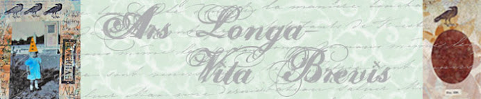
This one is a tapes style binding. It's one of the oldest styles of binding out there. If you ever take a look at a really old book--where the spine has those little ridges--that's tapes binding. You bind onto the tapes or thongs and then cover them using leather or book cloth. I opted not to cover the spine on this one, because it fit the feel of the book better. The covers are old bingo cards.
I have a couple more I'll try to get up in the next day or so.

Friday, April 17, 2009

Hope

The IAA is doing an on-going journal swap. Here is my page for this month:
This page was done using copic markers to spray the background and the writing. The wings are a stamp that I embossed and then colored in with copics.
I've decided to do a poetry theme for all my pages, since I'm a poetry junkie. I've got a bunch of more work to put up--I've been busy writing up some new course proposals for fall this year. I'm keeping my fingers crossed...

Wednesday, April 08, 2009

A-hoy.

Here is a page from my art journal. I'm sorry about the typed in text over the photo--but the photo was part of an application packet and I didn't think about deleting the text before I posted the pic.
I've really been enjoying the way that the colors of the copic markers go on the page. There is something so sharp about them. And at the same time the texture is almost velvety. I drew the skull as part of an experiment. Sort of an "I wonder if I could do this?" And I think it turned out well. That's the thing that I love about my journal. It's a space just for me. And we all need a space that we can just be in.

Tuesday, April 07, 2009

How To Color Tears With Copics

A brief how-to on coloring transparent objects using copics. Hope you enjoy!

Sunday, March 29, 2009

Copic ciao Airbrushing

One of the things I haven't talked about yet is the differences between the different versions of the Copic markers. There are three different basic styles: sketch, original, and Ciao. The Ciao and the Sketch have the same broad/brush tips, but the Ciao is smaller and round in shape. It's marketed as a beginner marker and tends to run about 1$ cheaper than the sketch. But bear in mind--they contain less ink, so you're going to need to refill them sooner. The original marker is square shaped and has a detailed point and a broad tip. Personally, I like the sketch, but I've got quite a few of the Ciaos.
One of the other big differences is that the Ciaos were not made to fit into the airbrush gun. They are too small. There is a way around it however. I've made a little video to show how to easily adapt them. For those of you out there who want to take the airbrushing plunge, but only have the ciao.

Thursday, March 26, 2009

Copic Airbrushing

Hi everyone;
As promised, here is a little something on using copic markers to airbrush with. Sorry it's a little late--I got Strep last week and it knocked me out.

You can do the airbrushing using a special made aerosol can full of air, but I use a mini-air compressor made for traditional airbrushing. It's fairly small and pretty quiet. It fits nicely on the floor next to my desk. Here is what it looks like:
To hook up to the compressor you need an adapter and the airbrush which comes in a kit made by copic, called ABS3, here is a photo of the kit:

You simply screw the can onto the airbrush on one end and attach to the air-hose of the compressor on the other end. Then the markers slide into the brush like so:

Flip on your compressor and you are ready to go. Here is a page from my journal--the background was done using copics and some stencils. Sorry the picture is a little blurry, my journal is a little thick and my scanner does not like it. Take a look at the diamonds on the bottom of the LH page--they are wood that I sprayed with the copics.

One of the things to bear in mind when working with the markers is that the color is less intense when sprayed then when you are drawing with them. Take a look at this sample:

I used the same red and green for the background and the doodles/text. It looks really different doesn't it? I keep thinking I need to create a color chart with the colors airbrushed to go along with my hand-colored color chart!

Since the markers can go on just about any surface, the possibilities are truly endless when it comes to airbrushing--plastic, metal, paper, wood, you name it! Ahh, I really do love these markers!

Monday, March 16, 2009

Copic Part 3

For my last installment on blending copics, I'm going to talk about blending using a pallet.

Using a pallet to blend colors is a lot like using the tip-to-tip process. The only difference is instead of placing colors directly onto the tip, you place them on a pallet first. You can use any plastic non-porous surface; like a transparency or a old cd jewel case.
So why would you want to use a pallet instead of just going for the tip-to-tip? Well, if you're going to be working in a larger area, or if you want to blend more than one color together then using a pallet makes life easier.

Here is a photo of my pallet--an old cd case--I took my makers and colored onto the surface to create spots of color.

Take the lighter color that you want to blend with and use it to pick up the color and then color just like you would using the tip-to-tip method.
If you want to blend two colors together with a third, take the 2 darkest, and color on top of one another on the pallet and then pick up the color using the third.
You always want to pick up using your lightest color. And when you're done, color off the marker on a piece of scrap paper to clean the nib.
Take a look at my sample:
For the body I used YG13, to pick up the other colors, E37, G17and E49. For the horns I used the blending contrasting color technique. And for the teeth, I used the colorless blender to pick up the W7 from the pallet and blend into white. I then went over the teeth with Y00.

Hopefully, in the next couple of days, I'll post some stuff on using the copics for airbrushing! In the meantime, if you have any questions, please feel free to email me, by clicking on the contact me button to the right.

Thursday, March 12, 2009

Copic Tutorial Part 2

Continuing on my discussion of copics that I started yesterday, here's some more info on blending.

When you want to blend several colors together there are a couple of different ways to do it. The first way, tip touching, which I talked about yesterday, is good for small sections. But if you want to blend into something a bit larger then you might want to try a different technique.

For blending in the same color family, I recommend gradation blending. Now, a good way to tell if you have colors that will work well together for this is by looking at the letter/number classification. You want colors that have the same letter and first number (which is color classification and brightness) and then try not have more than a two number difference between the second numbers. For example, b11, b13, and b14 would work wonderfully.
But it's not a hard and fast rule. Experimenting is the name of the game.
Take a look at my sample:

For the first step, color with your lightest, working in small circles and saturating the paper fully. Then while the first color is still wet, go in with the second and work up to 3/4 of the way. Right away, go back over with the lightest color to blend the colors together. Then go in with the darkest color and work up to the bottom 1/4. Go over it with the second darkest color and blend up, and then again with the lightest and blend up.
This technique took me a bit to get down, so practice, practice, practice!

Now onto blending contrasting colors!

There really is no rule for what contrasting colors work well together. But you do need to remember your basic color rules--since the two colors will be overlapping, they will make a third color where they meet. So if you use red and blue, you will have a little purple spot in the middle. This is especially true for the lighter colors. Just bear that in mind, if you don't want a big brown spot in the middle of your color blend!

Take a look at my sample:

You want to start with your lightest color and work in one direction, moving in straight lines, lifting slightly at the end of each stroke so that the color is slightly lighter. Don't worry about getting good saturation at this point, just get a good base coat. You want to go to about 3/4 of the space. Now come in with your contrasting color and do the exact same thing but in the opposite direction, covering to the 3/4 mark in the opposite direction. Now go back in with the first color and repeat. Then do the same with the second color. Keep going over it, until it's blended.

Hopefully, I will be able to get part three up tomorrow!

Wednesday, March 11, 2009

Copic Markers Tutorial

As promised, here is the first of my copic markers tutorials.

So let's start out with some basics. When I first looked at the copics, I had no idea what those crazy letters and numbers used to categorize them meant. Here's what they look like:
The letters stand for the color category--e for earth tones, b for blue etc. The numbers relate to the shades. The first number tells you how much gray is in the color 0 being none, and 9 being a lot. The lower the number the brighter the color. The second number relates to the darkness of the color. The higher the number the darker the color. If you have a RV09, it will be a bright deep red, while a rv99 will be a duller gray deep red. Understanding the number/letters is important when it comes to blending--since it's easier to blend within a color family.

Now for some coloring:
When it comes to using the markers it's important to remember that they are alcohol based--which is why they are low toxicity--but the alcohol causes them to dry quickly. To get an even color distribution it's important really saturate the paper. The best way to achieve this is to color in small circles. When you work with more than one color for shading, you'll get smoother effects if you start with a well saturated base.

One of the best features of these markers is that it;s impossipble to contaminate the tips. If you get one color on a nib of another, simply color it off on a scrap piece of paper.

Tip-to-Tip blending:
Since there's no risk of color contaminating you can blend in small areas by touching the tip of one color, to the tip of another and then coloring with it. You should always color with your lightest color.
Take a look at some examples:

The larger circles were done with R32 and a blender pen. I touched the pink to the pen and colored in small circles working up to the top so that's pink into white. While it was still wet, I gently went in with the r32 on the bottom end and blended it some more. When I was done, I colored off the blending pen and it was nice and clean.
This is a great technique for small areas, take a look at the little circles, I blended r32 with y21 using the tip to tip method.

Tomorrow, I'll post some more blending tutorials.

Tuesday, March 10, 2009

Journal Swap

Whew! It's been crazy busy here. But with the finishing of the Heirloom festival, I have time to do some fun stuff again!
I made this book--one of my first attempts in book binding with stiching into the spine. It was a lot of fun!
I used my copic markers--which I love, love, love--to decorate the covers. Here are some pictures:
Back cover-
Front Cover--
Side view of binding.

When I was the heirloom festival, I had a lot of students asking me about the Copic markers. Along those lines, I thought over the next couple of weeks I'd post some copic tutorials. So stay tuned!

Sunday, February 15, 2009

Sod's Law

This last week has been a living testament to Sod's Law--which states that not only will everything go wrong, but it will do so at the WORST possible time.
Here's what happened:
Our neighbors on the other side of the double accidentially severed their power line on tuesday. I got a call saying that inorder for the electrician to make the repairs the power had to be shut off on both sides--but only for an hour on wednesday morning. Ok, I said, no problem. I re-arranged my scheduale so that I'd be out of the house. Power went off. The electrician came.
And then the storms hit. (The wind was so ferocious that it caught my car door while I was getting in, ripped it from my hand and smashed it back into my head giving me a lovely black eye.)
And power went down all over the city.
We found ourselves at the bottom of the power company's to-do list.
Thursday, no power.
Friday, no power.
Then, we hear from our neighbors that the power is back on. Hooray! We come home, and low and behold, the power company had turned on the other side but not ours. So, we called and begged and argued and finally they came out and got it back on.
Ugh!
Needless to say, I am in a foul, foul mood.
Luckily, I managed to get this birthday present done for my friend Sarah. Here is her card:

And here is the ring I made for her. The doll is actually made out of UTEE. I made a cast from the original and then cast it using white utee. I used easy cast resin to fill it. The red background is sequin waste.
Here's hoping this next week is better than the last!

Monday, February 09, 2009

workshop day

This last Saturday we had a workshop day for the IAA and I taught a beeswax collage technique. Here is a photo of the sample:

And her is a photo of Ariane working on hers:
And here is Diana, hanging out. Take a gander at that lovely bag of Copic markers. I have serious marker envy just looking at it.


Shaun, who kindly hosted, has the sweetest pets. Here's a photo of her darling dog, who wanted to make art so badly, she had her nose pressed against the glass whining.

Here is another photo of the dog--can you see me taking the photo?
And lastly, here's Kristin holding the adorable kitty-cat.

Tuesday, February 03, 2009

A moment of perfect stillness

It's snowing here, again--admittedly not my favorite thing. Snow is ok the first time it falls and only if you don't have anywhere to go. But after the fourth or fifth time you find yourself thinking "son-of-a-#!*^&, now I have to go out and shovel again!"
But today I was looking out my window and I had what my yoga instructor calls a moment of perfect stillness. Everything inside of me just stopped--all that noise that is normally filling my head went quiet. It was such a wonderful moment, I had to take a picture.
This is the view out my window. I altered it in photoshop to turn it into a TTV.
Hopefully, I will have some art to post in the next couple of days. I'm working on a couple of projects for submissions, so they can't be posted. But hopefully I'll have other stuff done.

Sunday, February 01, 2009

Oh Darling!

I am just in love with Kris's new line of "Hello Dollies" that are Valentine themed! I am normally not a Valentines day sort of gal--as anyone who knows me well will attest, I am more likely to snort, roll my eyes and make gagging noises at overly romantic stuff. I think it has something to do with the fact that my idea of romantic doesn't always jive with the more traditional cupids and bows sentiment. For me, having my hubby hold my hair while I'm deathly ill from the flu and dry heaving, is the hight of romance--not exactly the sort of thing Hallmark makes a card for.
But I digress.
Back to the Dollies--they are so cute, they move even me to creating something sweet and love-dovey.
Here is a collage I made using a couple of images from her sheet. The main girl and the flowers. Take a look:


I think my favorite part of this piece is the wings--they were cut out of netting and then I dipped them in beeswax and then dusted them with perfect pearls. It was one of those serendipity moments, I was working with beeswax for the background and looking at the netting thinking to myself "Gee, I wish I could figure out a way to make these stiffer..." and then I saw the beeswax and thought "what the hey." It turned out really well. Here is a close-up.


Hope everyone had a good weekend and I'll see you soon!